6 examples of Prototypes for your Application
How do you turn Optimism into Confidence without breaking the bank?
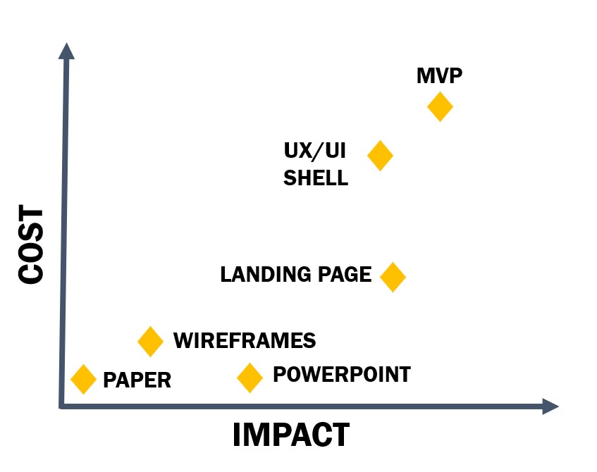
When it comes to developing digital products like a mobile app or web application your option is to spend a lot of time and money to build it and hope you got it right or create a cost effective prototype to prove you got it right before scaling. But “cost effective” is certainly a relative term and what is cost effective for one company or startup or entrepreneur may be completely out of the realm of affordability for another. So we explore 6 examples of prototypes examples for your application or digital product idea ranging from free to hundreds of thousands of dollars, the pros and cons of each, who they are best for, and most importantly their impact.
Subjective Cost/Impact Scale
Paper Prototype
Cost: $0 Free
Who you are: A visual thinker, creative and artsy but not technologically inclined. No budget yet as you’re in the the very early ideation stage.
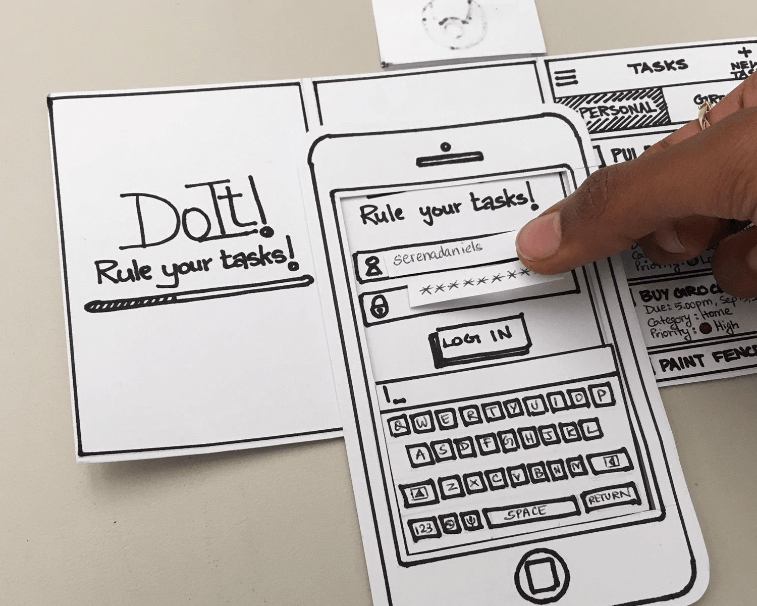
What it is: A paper mockup of your idea. Perhaps built of sticky notes, drawn on a whiteboard or a large poster board covered in hand-drawn screens showing interactions and flows. Maybe a slider like the one in the picture.
What its good for: Very early visualization, getting your ideas down on paper when the creativity strikes and without the distraction of a computer screen, outlining your vision for a creative or tech person to take to the next level. Also good perhaps if you’re hoping to get feedback or small investments from friends or family as they would be forgiving enough to overlook the primitive medium.
Pros: Free and easy! In fact, your kids could even help you out. No technical skill required.
Cons: Requires some creative sense. You could spill your coffee on it and lose your entire concept.

Photo courtesy of Justinmind
Powerpoint
Cost: $ Free to $; it’s probably already loaded on your computer. $160 for a license if you don’t already have it loaded.
Who you are: A business person dabbling in the creative side to help get your point across as cost-effectively as possible.
What it is: A Windows-based basic presentation program that comes on Windows computers and can be downloaded for Mac.
What it’s good for: Presenting your idea on a large screen for an audience or a webinar, and meeting with other business people.
Pros: Probably free or at minimum very low cost. It is a surprisingly useful “design” tool for non-designers; easy to use drag and drop, animations, and pre-built shapes. Pretty easy to figure out and will do a good job of walking someone through your concept and functionality. Powerpoint even has some interactive features available.
Cons: Time consuming. Animations and getting things to line up page by page is time consuming. It’s not considered “tech savvy”, so some audience members may find it a little old school.
Check out this impressive video of how someone built an Interactive Powerpoint Prototype
Wireframes
Cost: $ Free or very inexpensive for the basic programs. Figma is a great free basic option for up to 3 projects, or check out Justinmind if you want something interactive.
Who you are: Technically intermediate, a process person, analytical. You aren’t much interested in showcasing your idea’s beauty at the moment; right now you care more about the functionality. You don’t want to draw by hand and you’re comfortable downloading and figuring out how to use a fairly simple new software. You want to convey your idea as clearly and concisely as possible without frills.
What it is: A visual and simple representation of your app idea using basic shapes to indicate text, images, buttons, etc. that can be easily rearranged. In the design and development world “wireframes” can and does mean much more, and we do them for the vast majority of our development projects anyway when you are ready to start building, but this article which assumes you’re at the beginning of your journey and not already contracted with designers or developers so it really is just a more advanced way of “sketching” our your idea using a program instead of actually sketching.
What its good for: Wireframes are useful for helping programmers and designers think about the structure of the app you’re building. Can help get more detailed estimates from development partners. Designers will appreciate that you’re giving them the structure but allowing them the creative freedom to make it beautiful.
Pros: Inexpensive. Good for a technical audience when seeking feedback and input.
Cons: While wireframes are essential to most application projects, it’s really more of a behind the scenes look and for some it could come off as a bit boring. If you’re showing to developers, great. But if you’re hoping to use it to pitch to potential investors or get real user feedback, it might not generate a lot of excitement since it’s lacking the visual aspect.
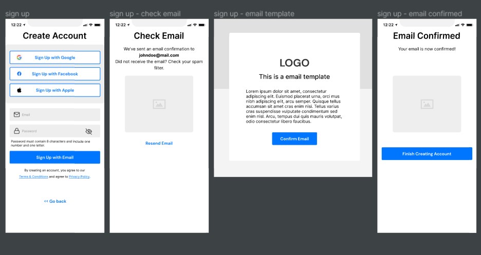
Wireframes example

Landing Page
Cost: Varies wildly. $-$$ for a basic 1-3 page professionally designed. Additional cost for domain registration, hosting, ads to drive traffic to your site, video production, etc. This guide is pretty solid and doesn’t get too deep into the weeds.
Who you are: Either a technically-savvy, creative person with experience and/or plenty of time on your hands to lean into doing it yourself, or you’ve got some money to spend to build it. You are likely a creative, marketing, or sales-type. You have some confidence in your idea and you’re ready to throw some funds behind it to prove interest, quantitatively, before you jump all on.
What it is: A marketing site used to gauge interest in your idea and possibly even capture leads and email addresses for future customers. A place to demo your app if you have anything to show.
What is good for: If done right it can give you great quantitative data-driven feedback around the interest, engagement, and marketability of your idea. Showing proven interest with data to back it up is phenomenal for pitching to seed investors. Capturing emails of people interested in learning more or being notified when a product is launched is a great way to hit the ground running and build a base of early adopters.
Pros: Relatively affordable. Can be especially useful if coupled with some early designs and videos that demo your idea (though having those adds a lot of cost). There are plenty of web designers out there ready to help within a short timeframe, and plenty of DIY tools as well if you’re keen to get your hands dirty. Always good to get your domain name locked down early in the process.
Cons: Steep learning curve and you do have to pay to get traffic to your site. It will likely end up costing more than you think once you add everything up. If you don’t have much in the way of designs to show yet it isn’t going to get you very far. May show interest but won’t show you a customer’s willingness to pay.
Totally awesome how-to example: Buffer
UX/UI “Shell” (High Fidelity Clickable Prototype)
Cost: $$$
Who you are: Very sure of your idea and willing to spend up front in order to seek funding via crowdsourcing and other informal avenues. You have confidence, but not *quite* enough to go all-in. Perhaps you’re a business founder and have yet to find a technical partner.
What it is: An interactive but not fully functional version of your app. Think of it like an Old West movie set. It looks good, the saloon doors open and close, you can walk down the street and sit on the stoop, tie up your horse even. But when you walk through the door you’re in the desert.
What is good for: Demos, gauging interest, early feedback, and pitching to investors. If building the MVP (see below) it’s a necessary step in the process.
Pros: It’s beautiful, it’s interactive, and visual so no imagination is required on behalf of the user. It’s impressive and great for showing investors and gaining buy-in. Provides crucial information about the user experience.
Cons: Could be expensive relative to it’s impact unless you’ve at least consulted with backend developers early on in the process. Without effective developer/designer collaboration you could end up with a “tip of the iceberg” problem where the “pretty” 20% front end causes 80% of the feasibility issues or complications on the back end. Or you could perhaps underestimate how much backend development needs to actually be done to have a functional application. Might be over-featured compared to the MVP app you can actually afford to build, which could turn off some folks who were expecting to see more based on a front-end only version that overpromised on features and functionality.
Functional MVP (Front end & Back end development)
Cost: $$$$
Who you are: Either a technical founder or Founder who has partnered with a strong full stack development team who gets it. You are fully invested in your idea and it’s success and ready to make the leap. You are confident in your solution and just need to test adoption before in order to secure funding or start generating sales so you can self-fund scaling up and out.
What it is: An MVP stands for “Minimum Viable Product”, a method of development that defines the bare minimum set of functionalities (features, behaviors) that solve a specific problem. A scrappy but fully-functioning version of your big idea. This first version lacks bells and whistles and focuses solely on the features that offer value to the users.
What is good for: Validating your idea in the marketplace, analyzing user behavior and engagement with the app, helping prove product-market fit, possibly for pitching to more sophisticated investors, and gathering necessary feedback before scaling.
Pros: Most impactful type of prototype. It is fully functioning, albeit likely without all of the features you want. If it is a mobile app it’ll be available to download in app stores. Since you didn’t build in all of the features right away you’re able to quickly pivot your idea to better match the needs of the users, thereby increasing your chances of success and not going broke in the process.
Cons: Won’t have all of the features you desire, but if you partner with the right team it will have the features you need to test and prove fit. Most expensive type of prototype.
Example here of a Mobile App MVP we recently launched in the app stores!
The Takeaway
There are many ways to accomplish your goals, this guide covers just six of them. Depending where you are in the process, a logical progression of turning your app or software idea into a reality may look like Powerpoint to mock up something simple to let others play around with it and get some early user feedback, then a landing page to prove there is some marketable interest, and building a fully functioning MVP to help prove product-market fit and get maximum learnings prior to scaling. We can help no matter where you are in the journey. Our consultants-not-coders and product development muscle help you to level up your idea with experienced, US-based technical partnership. Contact us for a Free Consultation if you’d like to discuss your idea, no matter where you are in the process. We love what we do and we love helping entrepreneurs and companies with big goals bring their vision to reality. Oh, and subscribe to keep getting Insights like this delivered right to your inbox. Best of luck to you!

